Unolia on a phone
Below tablet width Unolia now has a section bar, a context bar with a collapsed breadcrumb, and a Menu button that opens the page’s sidebar as a sheet.
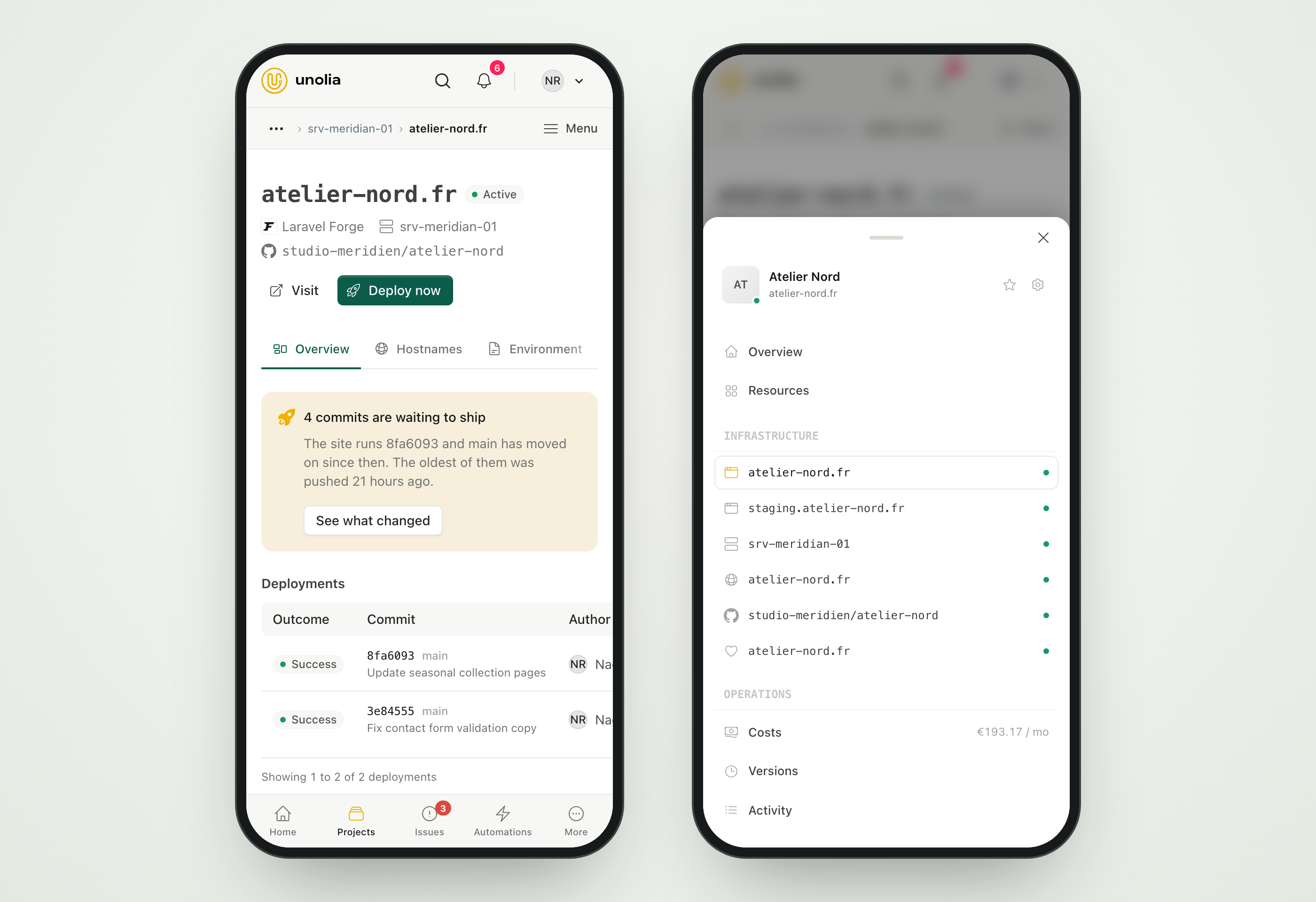
Unolia is a desktop tool most of the day, and a phone tool the moment a client calls. The phone layout is now built for that moment rather than being the desktop squeezed.
A section bar sits at the bottom with the main sections and a More sheet for the rest. Above the content, a context bar carries the breadcrumb, collapsed the way most design systems do it: the parent stays a direct link because up one level is the most frequent move, the current page is bold, and anything before the parent folds behind an ellipsis you can open. On a tablet the full trail shows.
On the right of that bar, a Menu button opens the page’s own sidebar as a bottom sheet, so a project’s domains, sites, servers and repositories are one tap away on every page of the project. Swipe it down or tap outside to close it.